Become a data superhero: how to convince your audience with data!

Analyzing data and getting the right insights is one thing. Impact with data is another. In this blog, we reveal the secret weapon: the combination of data visualization and storytelling. A dynamic duo that turns boring data into exciting visuals and captivating stories. Data visualization makes it possible to simplify complex information, to spot trends and to share insights with others. By adding storytelling to the mix, you’ll create a connection with your audience, inspiring them to take action based on data. Ready to unleash your inner superhero? Read on to learn more about the power of combining data visualization and storytelling and how to harness their power…
I. The Power of Data Visualization
1.1. A trusty side kick for data analytics
Data analytics can feel like finding a needle in a haystack. That’s where data visualization comes to the rescue! . It transforms mountains of raw data into charts, graphs, and infographics, enabling us to spot trends, patterns, and outliers at a glance. Allowing you to analyze complex data faster, more efficient, and more intuitive.
1.2 Give data a personality
Data visualization turns complex data into colorful, easy-to-understand visuals, simplifying the message and highlighting the important stuff. It breaks down barriers and gives data personality with stylish charts, graphs, and infographics. Get ready for exciting insights that anyone can understand! Whether it’s tracking sales performance, visualizing market share, or mapping customer demographics, these visual goodies make data a whole lot more exciting. Say goodbye to dull reports and hello to data with personality!

II. The secret sauce: Story telling
You might not like it, but data can be pretty boring. At least, for some people 😉 That’s why it’s important to combine data visualization with storytelling to create magic. It’s like Batman and Robin joining forces to save Gotham City. Data visualization sets the stage, and storytelling takes it to a whole new level. Here’s why:
2.1. Emotional connection with your audience
When you infuse your data visualizations with stories, you’re not just presenting information, you’re taking your audience on a journey. You’ll have them at the edge of their seats, eager to see what happens next.
2.2. Make data come alive
Plenty of data talents work with amazing data sets, but have no idea on how to present them. That’s where storytelling comes in. Storytelling enhances the meaning and context of your data insights, making them more relatable and impactful. It helps you bring meaning to your data, engage your audience, and inspire them to take action. You’ll be the data hero that sparks change and drives business success.
2.3. Captivate, engage, and inspire action
Imagine you’re a master storyteller, leading your audience on a thrilling journey. Data visualization helps you guide them through a sequence of insights, like turning the pages of an exciting book. Each visualization is a chapter that reveals something new and keeps the audience engaged. You’ll have them hanging on to every data point, eager for the next big reveal. Hard to imagine? Pretty sure opening a presentation with a shocking number will make your insights stick and will inspire people to action.
III. Practical tips to harness this super power
3.1. Choose your visualizations wisely
Different data requires different visualizations to shine. And each audience has his own preferences as well. A marketeer likes it more visual than a finance guy for example. Whether it’s bar charts, line graphs, or heat maps, each has its own strengths. So, get familiar with the options and choose the visualizations that best showcase your data’s superpowers.
3.2 Design to catch people’s attention
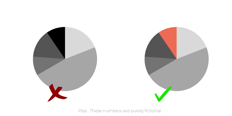
Pay attention to colors, fonts, and layout to make your visualizations pop and to make sure your audience watches the right things. We’re not talking about color books though… Keep it clean, organized, and visually appealing.

3.3. Unleash your inner storyteller
Data always has a purpose. Create a clear storyline for your presentation connecting all the dots. Think about an icebreaker that grabs everyone’s attention. Small elements that grab their attention again and a nice summary at the end to inspire action.
3.4. Interactivity as your secret weapon
Add buttons, sliders, and filters to let your audience explore the data themselves. It’s like inviting them to be a part of the adventure. With interactive elements, you’ll capture their attention, ignite their curiosity, and keep them coming back for more.


In short, it is the combination of data visualization and storytelling that really moves people to take action within business. Both skills can be developed by the way. In our data traineeship for example. A 26-month program where you get the chance to grow data and people skills on assignment, in training and with a mentor. All we ask is a shit load of passion for data and the willingness to conquer the data world together.